 Online Portfolio


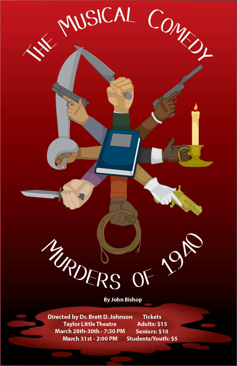
For the 2019 Spring Semester, the Theatre Program performed “The Musical Comedy Murders of 1940”, and my class, Computer Illustration, was tasked into creating the official poster. I have already been a fan of theatre, so this project was one I was fully dedicated into making it the best it could be. A big influence on my design was the 1985 Movie “Clue”, and the German Poster that depicted six entangled arms, representing the six guests and possible murderers, with each holding a weapon. I wanted to use a similar idea with the Musical. There were details I changed to be more about the musical. I made eight arms instead of six, to include all the characters in the musical, then I researched exactly what weapons were used. Afterwards, I found good references to make the vectors for the weapons, then fixed the hands so they would hold each weapon properly, then incorperated an important prop in the musical; the journal.

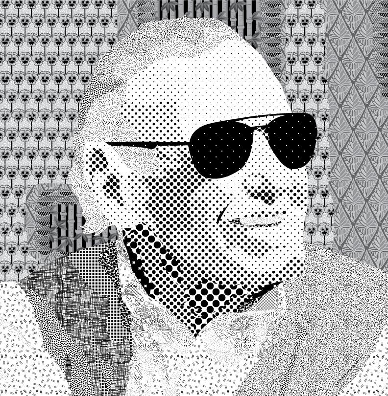
Stan Lee is a national icon. The creative leader of Marvel, a writer who made such incredible superhero characters that are still beloved and inspiring even to this day. So, using different patterns in Adobe Illustrator, I recreated an image into a portrait.
The project this was made for was originally given before he passed away.
May he rest in peace.

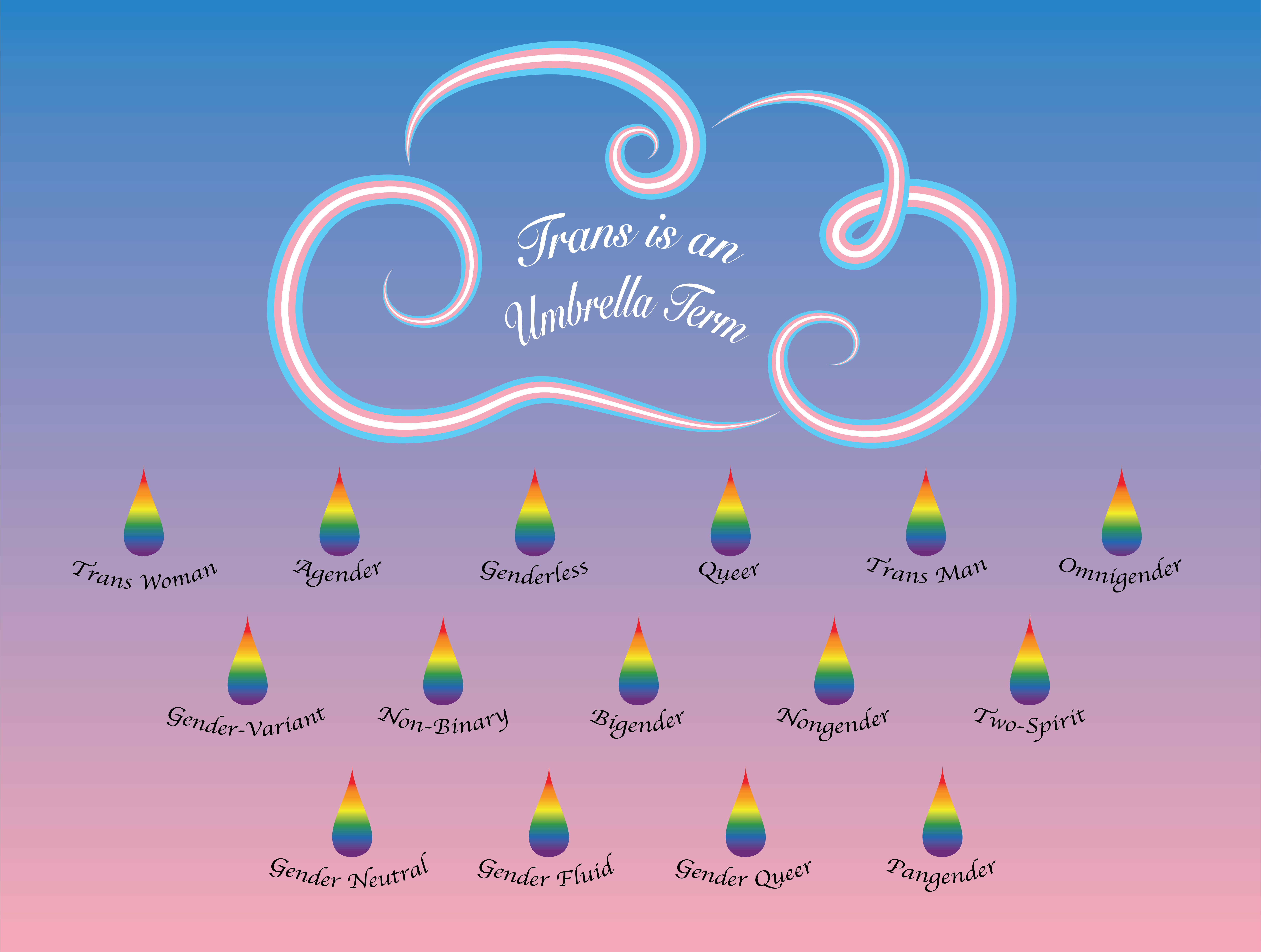
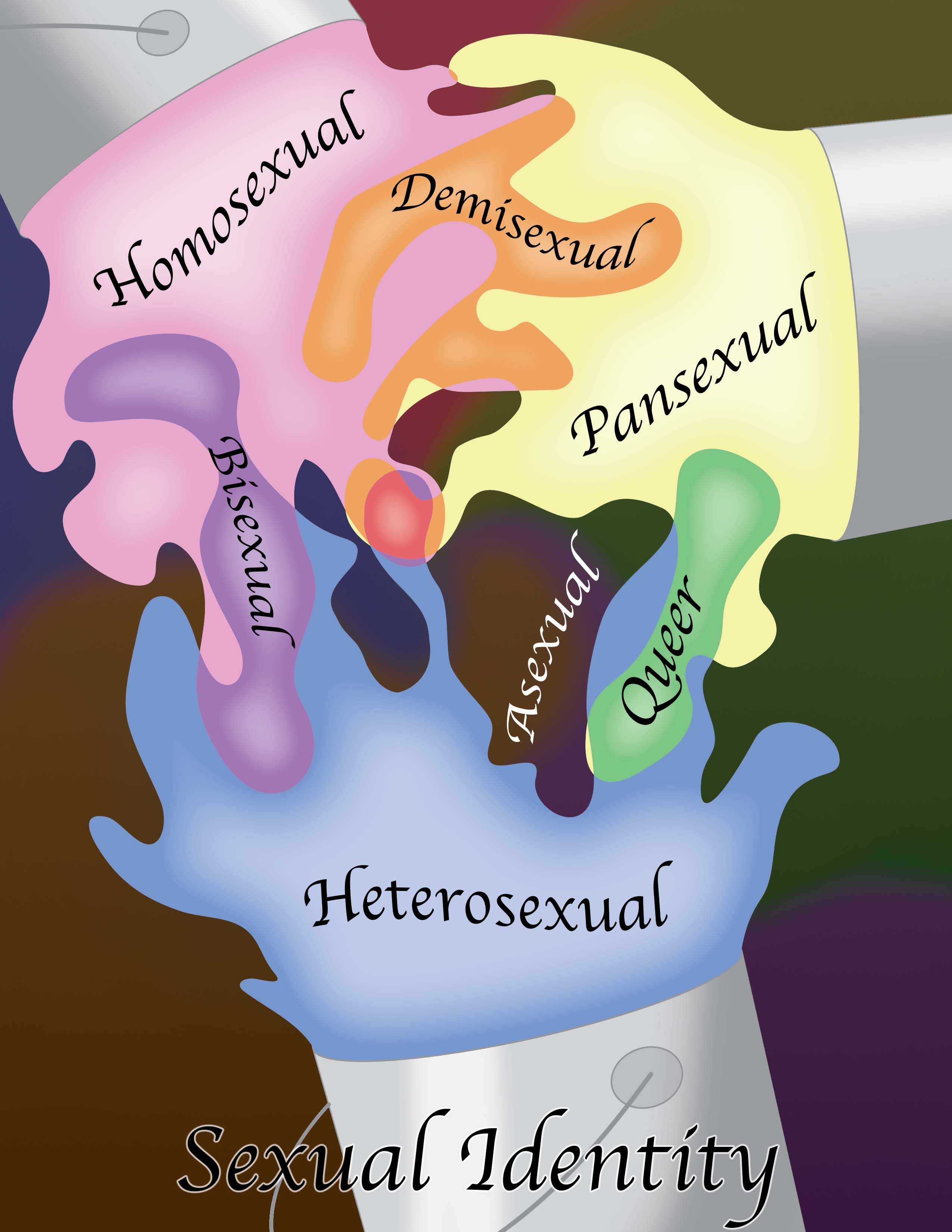
Soon after graduating from mercyhurst, I returned home and was soon comissioned by an employee at Persad; a Mental health clinic located in Pittsburgh, Pennsylvania. The woman I worked with wanted two pieces: An umbrella term depiction of transterms without using a typical umbrella, and then a piece for the spectrum of sexuality. I actually made three versions of the Sexuality spectrum; Sexual Identity, Orientation, and Behavior. The image shown here is about Sexual Identity.


Along with the trans terms and Sexuality diagrams, I was also comissioned by a family member. They work as a therapist, and wanted to apply a likert scale to their work. A likert scale is a simplistic liniar diagram that can be used to desribe one's emotions in a simple way. However, my family member wanted one that included their favorite animal; the sloth. This commission was done using a simple but appealing sloth design with slight variations between each image representing the progression of emotions.

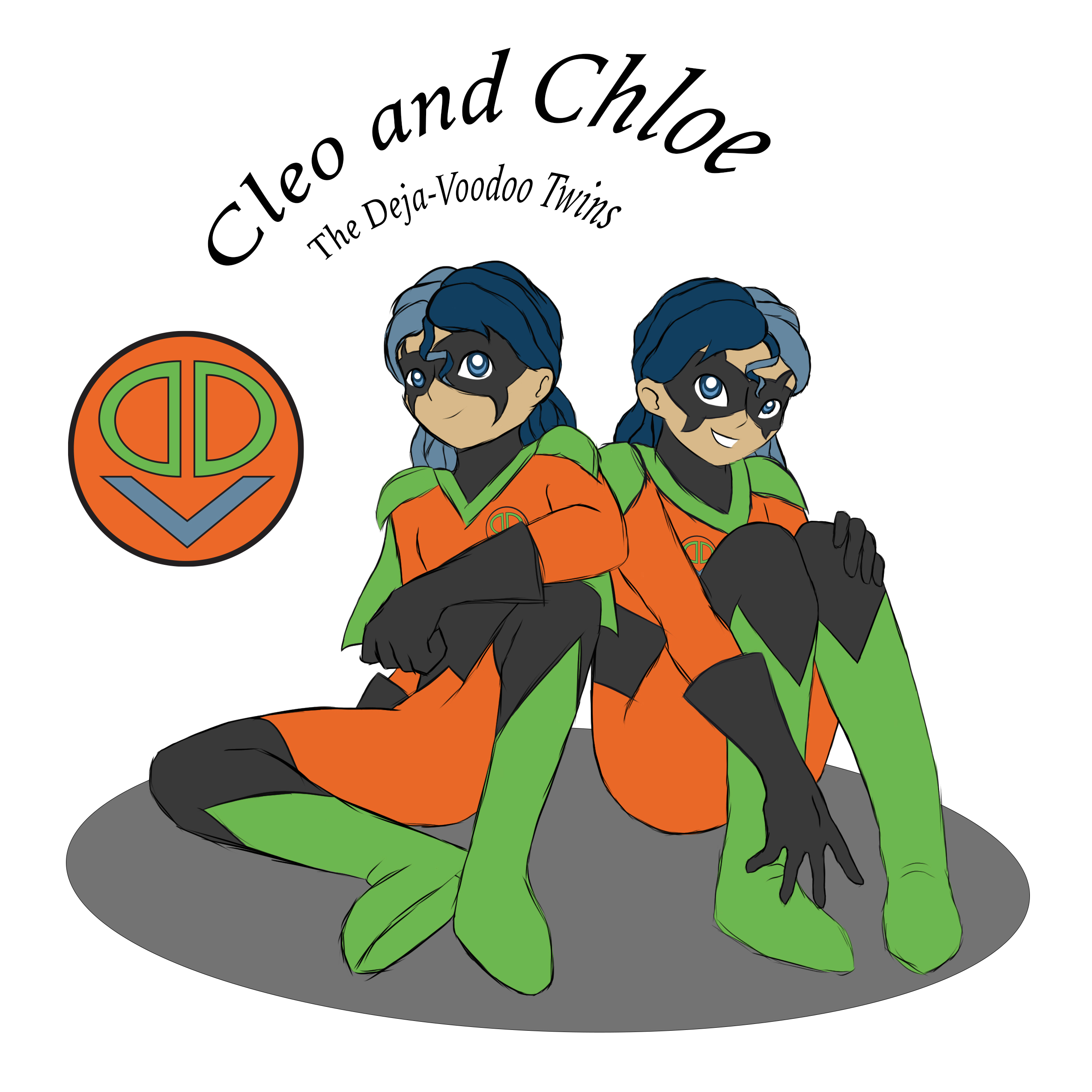
I've always loved superhero stories. And with how much I enjoy creative writing, it was only a matter of time until I came up with my own hero. Or rather, heroes. I first thought of these characters while I was still in high school, and by my senior year of Mercyhurst, my art style had since improved greatly. So, during a project for my Advanced Illustration class, in which we would design a short one-page comic, I decided to return to this old idea, give their designs a much needed upgrade, and further develop their story.
My characters are twin sisters that look nearly identical but with certain details that the reader would be able to catch onto, such as the which direction curves hanging off their masks point to, whether the edges of their boots and their suits' waist belts go up or down, and which side of their hair is a darker shade. I used a split-complementary color scheme of blue, orange, and green, using black as a neutral shade to bring it together. In terms of powers, one twin sister has the ability to look into the past and the other can see into the future. However, because their abilities are still developing, they would not have full control over when the visions occur, though what they see always pertains to their mission.

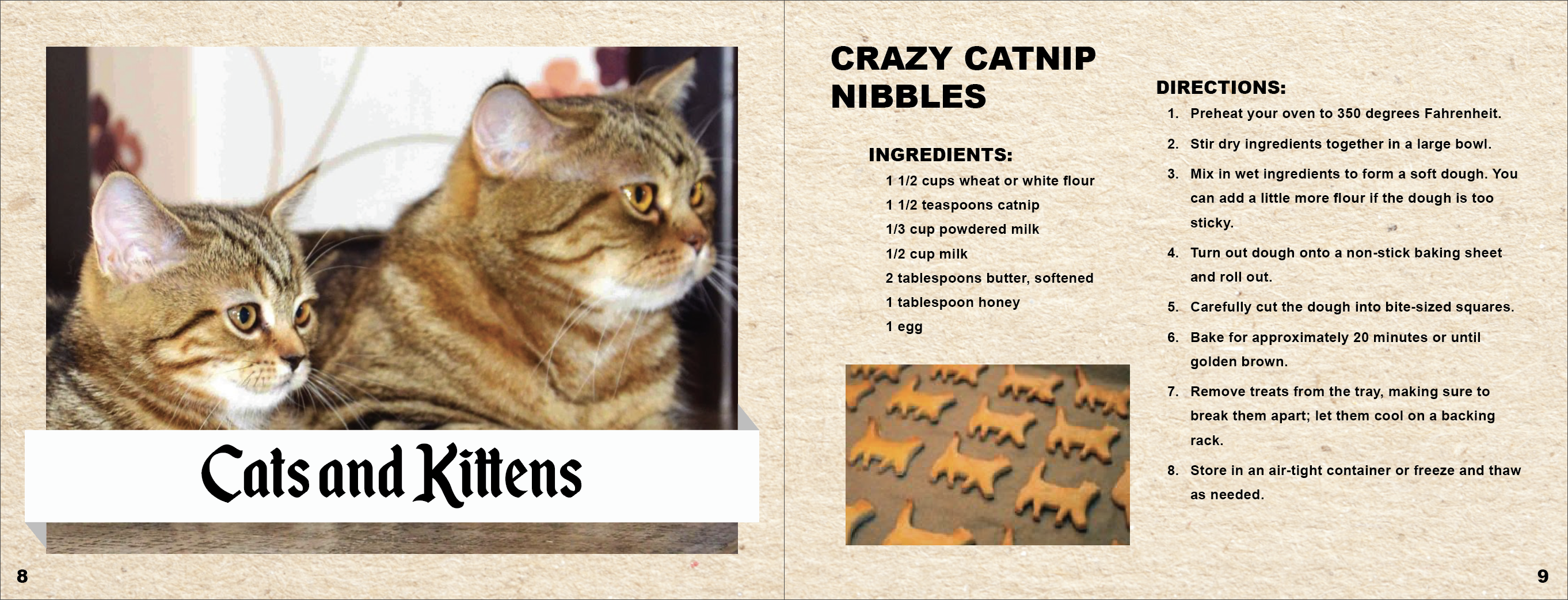
During my junior year of college, I took a Type and Publication class that introduced me to creating brochures and booklets. One of the later assignments was to create a small recipe booklet at least sixteen pages long. I chose a topic that I have always been passionate about; animals and pets, and made a cute pet treat booklet that I imagined people could have in ther kitchens just for fun.
I researched what kinds of animal treats could be made with normal ingredients at home, and what kinds of treats were safe for pets to consume. An additional feature I included was emergency contact and pet health information on the back of the booklet. While that usually would be where copyright info or contacts would be placed. I beleived since this was only a school project and wouldn't actually be published, it was more fitting and important to have safety measures for the pet’s sake. Inside the booklet was split into three sections for different types of pet treats: one for dogs, one for cats, and one for birds, fitting the image on the front cover.

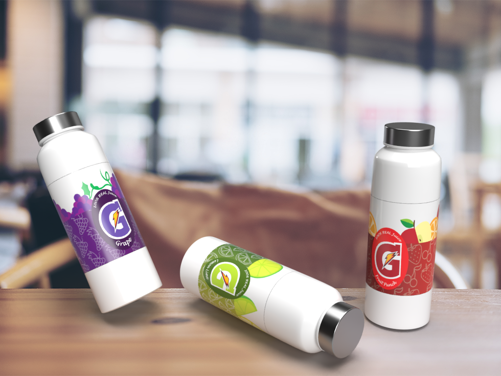
For Computer Illustration class, a fun project we were assigned was to rebrand a certain type of beverage. I chose the Gatorade products to reimagine the label for a younger audience, something similar to Juicy-juice boxes. The designs I came up with had simple vectors of fruites associating to each flavor both in the foreground and a more transparent version in the background. The top section would be transparent similar to some sports water or juice labels.
I revisited the designs during my Senior year to rendering the labels onto three dimensional objects, a task I thought would be difficult before I knew about Adobe Dimensions. For the bottle type, I chose one that was tall with a metallic looking bottle cap and altered the labels’ sizes to wrap fully around the bottle’s circumference. Though looking back I wonder if there were more dynamic models like how some Gatorade bottles are curved and have bevels and concave sections.

Creating a website from coding is something I would never imagine I'd be anywhere experienced in before my Junior and Senior years of college.
Taking an Intermediate Web Design class, I was able to use the basics of website coding and using programs such as Adobe Dreamweaver. Two of my favorite projects were the blog development and the ecommerce shopping cart style websites.
For the blog development assignment, we were given freedom to choose a given subject of our own interest and design a pretend blog with a home page and an article page that holds information your chosen subject matter. I chose to make my project about an online hobby I was highly invested in at the time; Doll Customization. I loved watching the process and seeing creators turn old dolls into new something one of a kind. For the blog, I knew I wanted the color schemes to be bright pastel and full of color to match the often bright colors you see in a doll. The website only has the Home and Article pages, and is not fully functional as that was not required for the project, but the result is still one that I am proud of.
The shopping website was the final project and had a lot more put into it. Again, we were allowed to schoose whatever subject matter we wanted, and I decided on jewelery. The assignment was for a home page, article page, and three item pages all with the necissary functional buttons. The page titled "Geeky" is the article page I decided to expand upon, and three items listed below have their own pages with the item's description, pricing, and reviews. Again, the website is not entirely functional, but I am happy with the final result.

Another favorite project from my Computer Illustration Class during my Sophomore year. For our Final Project, we had to create an animal based character for greeting cards, give them an easy to follow backstory, and design two cards, as well as a mug design and their logo. I brainstormed a few animal ideas, until settling on a western spotted skunk. This type of skunk lives in western North America and are known to stand on their front paws to bring their rear up in order to get better distance on their defensive spray whenever a predator is near.
Their “handstand” reminded me of Hip-Hop dancers, so I made my skunk character a breakdancer, gave him an easy to understand backstory, and a name: DJ PU. Designing his outfit was simple, with an oversized hoodie and a sideways hat. For the cards, I focused on events that included high energy, and narrowed the two choices to a Birthday Party and New Years’ party invitations. I wanted the designs to be eye catching, particularly for young children wince that was the age range I imagined this character would pander to. I used fonts that reminded me of street graffiti, came up with simple catchphrases to include in the card, and had fun with the designs. I wanted them to look like DJ PU was at the party himself, even including a DJ booth in the New Years card.